The Peters Map
The Third Wave, A. Toffle, 1980
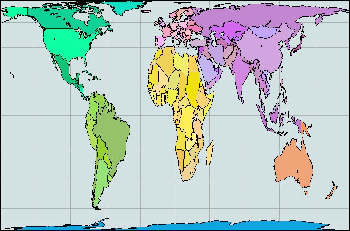
Some map makers, meanwhile, are rebelling against the conventional world map seen in every Second Wave classroom. Since the industrial revolution the most commonly used map of the world has been based on Mercator’s projection. While this type of map is convenient for ocean navigation, it wildly distorts the scale of land surfaces. A quick look at your handy atlas will—if it uses a Mercator map— show Scandinavia as larger than India, even though the latter is actually almost three times larger.
Hot controversy rages among map makers over a new projection developed by Arno Peters, a German historian, to show land surfaces in proper proportion to one another. Peters charges that the distortions of the Mercator map have fostered the arrogance of the industrial nations and made it difficult for us to see the non-industrialized world in proper political, as well as cartographic, perspective.
“Developing countries have been cheated with regard to their surface and their importance,” Peters contends. His map, strange to the European or American eye, shows a shrunken Europe, a flattened and squashed Alaska, Canada, and Soviet Union, and a much elongated South America, Africa, Arabia, and India.
[The Peters Map is below]